Beyond the 'Done is Better Than Perfect' Trap
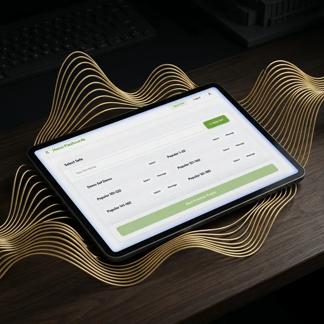
Last month, we essentially tore down the interior of Hanzi Flashcards and rebuilt it—over 1,500 lines of code were rewritten to move from “functional” to “premium.”
When you’re building a tool, there’s a dangerous moment where you say: “It works, users can log in, let’s stop.” If you stay there, you’re just a utility. We wanted to be a habit.
We touched nearly every corner of the app, replacing the “Old Web” feel with a custom Design System. But the biggest upgrade was giving the app a voice. We’ve integrated high-quality Text-to-Speech (TTS), so you finally get the auditory feedback necessary for mastering Mandarin tones.
Combined with more responsive layouts and the official Google Play Store link, this wasn’t just a list of features; it was a total removal of friction. A button that’s slightly off-center—or a tone you can’t quite hear—is a reason to quit. We just removed those reasons.
How often do you find yourself quitting an app because of tiny, nagging UX friction?